
Creating documents is tedious, repetitive and time-consuming – docCentral was created to help staff create documents more quickly and efficiently.
However, over time, the tool became cluttered as more features were introduced. This project sought to make the process quick, clear, and precise again.
What An internal product at Central Provident Fund Board Singapore
Who UI/UX Design Intern (Me) + UI/UX Designer
What I Did Conducted testings sessions with existing users to gather qualitative insights on a re-design
+ Translated insights into UI & UX improvements and prepared files for development
Results A redesigned tool now used by over 1000 government officers

Problem + Background
– the increasingly long process of creating documents
docCentral helps staff members generate highly similar documents quickly and efficiently (e.g. employment contracts, populating application forms). Since its introduction a year prior, many new functions had been introduced, making its existing platform long, complicated and harder to use.
Pictured below: the existing version of the tool – users often encountered difficulties and frustration as details were easily missed out on given the lengthy page

The team set out to revamp its UI to enhance usability and better serve its users moving forward. This project started before I joined the team – by the time I joined, the team had laid the groundworks of the new UI and created a Figma prototype to test with existing users.
Pictured below: version 1 of the proposed redesign (created by the UI/UX Design intern before me) – instead of a long, overflowing screen, the process was to be split up into 3 steps across separate pages. There will also be a summary page, once users have created the project successfully.

User Testing
– discovering the good, the bad and the areas for improvement
User testing involved 5 different existing users, and each session was conducted by the UI/UX designer and me. The participants were asked to complete various tasks using the Figma prototype per our instructions. During this, we took qualitative notes on how they navigated the prototype and evaluated the success of the respective tasks based on their ability to complete them.
After all the tasks had been attempted, we then asked some open-ended questions about their thoughts on the redesign, any points they found confusing or more on their thought process during the tasks. These qualitative notes were then analysed afterwards to identify key themes and areas for further improvement.
Pictured below: the FigJam file used to conduct User Testing

Key Insights
Key Problem #1
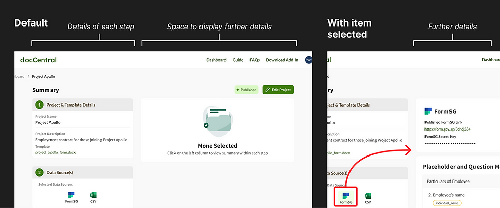
There was a poor utilisation of screen space in the Summary, resulting in users missing out on valuable details.
E.g. on the Summary page pictured on the right, a third of the project summary overflows out of the main screen space – some users did not notice that there was more information further down on the page

Key Problem #2
There was insufficient guidance on the use of the CSV file, leading to confusion about completing certain tasks
E.g., due to technical limitations, the feature to upload and use a CSV file had a very convoluted user flow – without guidance to use the feature, most participants encountered challenges completing this task successfully

Key Problem #3
There was insufficient guidance on the use of the CSV file, leading to confusion about completing certain tasks
E.g., due to technical limitations, the feature to upload and use a CSV file had a very convoluted user flow – without guidance to use the feature, most participants encountered challenges completing this task successfully
Improving the interface
– addressing insights from user testings
Key Insight #1 – There was a poor utilisation of screen space in the Summary, resulting in users missing out valuable details
Key Insight #3 – There were a few features that, while intended in the design, were not apparent to the participants.

Reshuffling the layout of information – A redesigned Summary page, where all the high-level information will be prioritised at the top of the page instead of being in a column extending beyond the page. This allows users to have a clear overview from the get-go.
Making clickable elements look more like buttons – Elements that previously looked static (e.g. the 'FormSG' and 'CSV' buttons) were modified to look more interactive, and placed more prominently

Key Insight #2 – There were a few features that, while intended in the design, were not apparent to the participants.
Visualising the process and progress – Instead of only giving users wordy instructions and a partial view of the entire process, a progress bar for the most confusing feature was included to illustrate the steps necessary for the feature
Alerts and Errors to Nudge – On the Summary, alerts and error messages (styled after mobile notifications) were also introduced to guide users by nudging them to complete any overlooked steps


Designing in a team
– using a design library
The redesign was completed with the use of the team's existing Design Language System (DLS). Apart from making changes to address UI issues, I also made changes to better align the new UI with the team's DLS, and also expanding the DLS to include components created for docCentral.
Apart from fellow designers, I also had to organise files to be handed to the front-end developers. This was done directly in with Figma's Dev Mode, which also allowed for comments and explanations to be included in the final file.

