
Like many other travellers, I find custom maps a helpful way of making and consolidating travel plans. With its extensive online mapping tools and capabilities, I often turn to the custom mapping features of Google, GoogleMyMaps.
However, both platforms can be clunky to use for travellers, both before and during the trip. This project re-imagines the two platforms to make it more usable both for travel planning and while on-the-go.
What A 3-day UX Challenge
Who Myself, as Researcher & Designer
What I Did Designed and conducted quantitative and qualitative user research to gather insights
+ Synthesised insights into UI & UX requirements, design and an interactive Figma prototype
Results A proposed design enhancement for Google's custom map features, tailored to travellers using it on the go

Problem + Background
– making custom maps do more while on-the-go
This 3-day challenge surrounded the question – How might we improve the user experience of GoogleMyMaps to serve travellers better, despite the availability of competing platforms with similar functions?
The goal was to improve the user experience – supporting users in creating custom maps, sharing and collaborating on them with friends – and enhance the platform so that it could have an edge over other custom map platforms.
Before creating a solution, I first wanted to understand the people I'd be designing for. The target user group I've defined was users who use the platform for trip planning and while on the trip.
I wanted to find out how the quirks and habits of different people while travelling – what are users’ travel planning processes? What are their pain points, needs, wants & goals with travel planning?
User Research
– understanding how different people travel
Online Survey
The survey asked about participants' backgrounds (how often do you travel?), their travelling habits (who do you typically do travel planning with?) and about the tools they used before and during their travels (what features would you find most useful in a travel planning platform? ).
Respondents were pooled from my own friends and family. In total, the survey had 20 respondents comprising individuals with varied travelling frequencies, ages and choice of travel partners. Given the short duration of the challenge, I deemed this amount to offer a sufficient variety of perspectives.
Pictured: the key findings – find the full survey here:

Semi-Structured Interviews
Apart from surveys, I also conducted two quick interviews with two friends – both who travel at least thrice a year, and each typically travel with friends and family respectively.
I asked about their travel behaviour and more about their habits while travelling. As opposed to the survey, the interviews allowed me to learn more about the challenges and habits of how both people travelled.
Pictured right: an affinity map of the interviews, also found here: https://www.figma.com/board/eBGhInCesY2REgOuSahk5q/Micro-UXD-Challenge-Affinity-Map?node-id=0-1&t=oSt0ExpNvMEziTbe-1

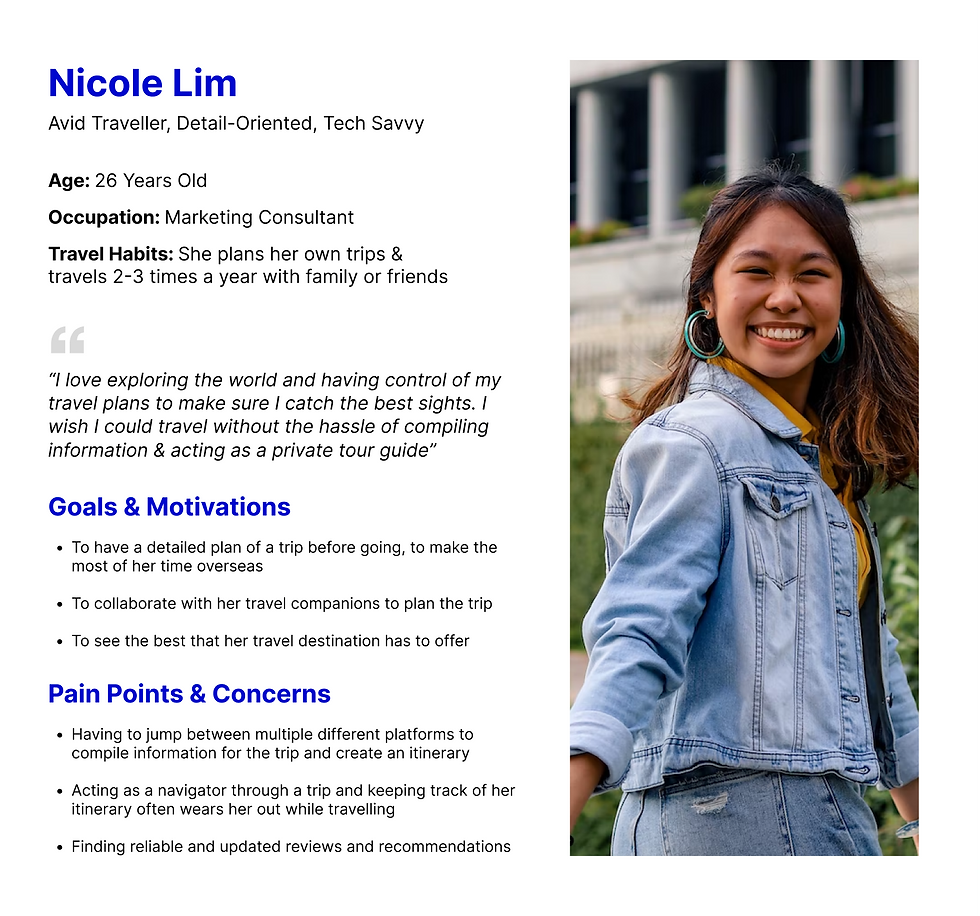
User Persona
With the user research done, I compiled it into a user persona for ease of understanding who I was designing for.
Design Audit – understanding what I was working with
With an understanding of the users, I now turned to the Google platforms and its competitors to understand the current landscape, and what features were available, and what were not.
To do this, I took a look at GoogleMyMaps and 2 of its competitors – Wanderlog and TripAdvisor. I examined both the desktop and mobile versions, taking note of the pros and cons of the various platforms.
Platform 1: GoogleMyMaps
Pros
-
Collaborative – shareable with travel companions
-
Somewhat customisable – ability to save locations on a map, ability to give custom names
Cons
-
Limited information on places of interest – basic information is provided, but not very informative
-
Not well integrated with Google Maps – not fully integrated with the rest of Google Maps, and you need to go to Google Maps to access things like reviews and photos
-
Limited in functions – primary serves to show locations, but does little to provide other helpful information or customisability in travel planning
-
Not well suited for both travel planning and travelling


Platform 2: Wanderlog
Pros
-
Comprehensive planning tools – saved location list, interactive map, budget planning, integrations with bookings platforms (e.g. accommodation)
-
Helpful information – information on locations, in-house blog
-
Highly customisable – customisable itinerary split across days of the trip, with directions between locations, route optimisation
-
Collaborative – shareable with travel companions
-
AI Assistant – offers suggestions and ease mental load
Cons
-
Possibly overwhelming – overloaded with information, cluttered UI may make it hard to navigate
-
Focus on planning stage rather than travel stage – great as a source of information but not immersive, e.g. seeing directions on Google Maps vs. being guided on where to go
-
Relies on third-party apps for directions – tries to support travel stage, but users will still need another app for navigating

Platform 3: TripAdvisor
Pros
-
In-depth information on places of interest – given positioning as a advisory platform for all things travel
-
Collaborative – shareable with travel companions
-
Highly customisable – customisable itinerary split across days of the trip, consolidates plans and information related to the trip
-
Helpful tools – recommendations for the location, but not location-specific (i.e. not related to added items)
Cons
-
Possibly overwhelming – overloaded with information, large amounts of information may make it hard to navigate
-
Focus on planning stage rather than travel stage – supports user in the planning stage with information, but not so much in the travelling stage in terms of navigation


Mapping the User Journey
Having looked through the platforms and what they have to offer, I decided to map out a (brief) user journey to understand how each platform supports users in the travel planning process. With this, I could clearly see the gaps that could be addressed with Google's maps.

Prototype – crafting a design
From my research, travellers need an easy-to-use, customisable and collaborative platform that can help them organise an itinerary, allowing them to not only coordinate with their travel companions, but also navigate with ease while travelling.
To draft out the solution, I first identified what I wanted to improve about the platform. Following the user journey (shown earlier), I identified how Google's custom maps could be improved to better support users along the way.

Design Requirements
Key Enhancements:
-
Collaborative itinerary maker with information beyond just locations
-
Responsive & personalised tour guide for on-the-go use
Key Tasks
-
View planned itinerary
-
Track itinerary while on the go
-
Navigate between locations
Platform of choice: Mobile
-
Integrated into Google Maps, an existing app, to centralise tools used
-
Users typically use mobile platforms while travelling
Other Requirements
-
Collaborative – allow viewing and edit access from multiple users
-
Easy to use – avoid overloading with information
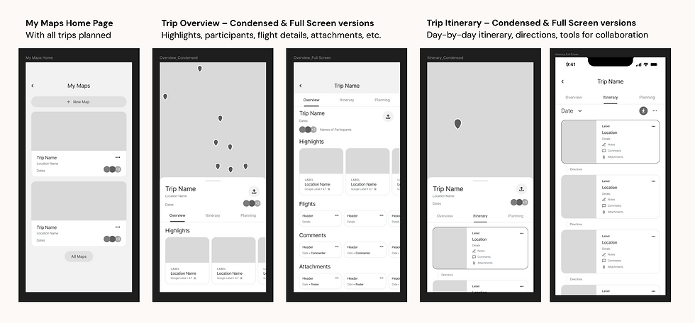
Wireframes
Since GoogleMyMaps is sorely lacking in the "Preparing" and "Travelling" steps, I decided to focus my solutions on the two steps for the purpose of the challenge.
With those improvements in mind, I proceeded to lay out my solutions in the wireframes.


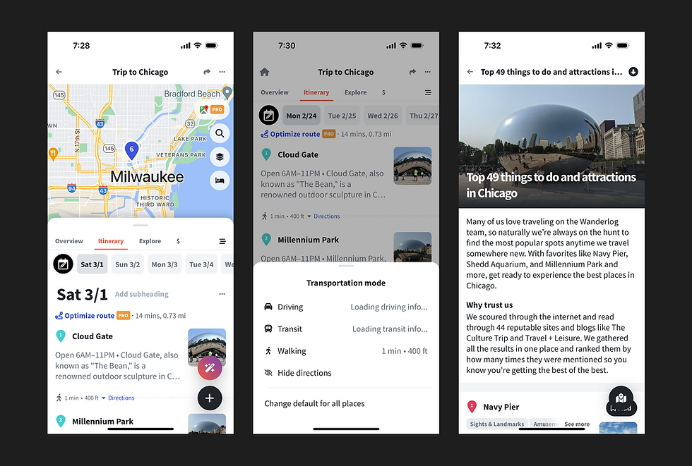
Prototype
And now it's time to build it out!
Find the prototype here: https://www.figma.com/proto/sRCovwoorszhwByn6FTkeX/Reimagining-Google-s-Maps-%E2%80%93%C2%A0UX-Challenge?node-id=0-1&t=kuuWgh58CVusb7Rl-1
Note: you'll have to toggle the 2 flows in the prototype


Evaluate – finding out if our design solved the desired problems
To assess our design, we carried out 2 forms of evaluation, namely User Testing and a Heuristics Evaluation. These methods allowed us to gather insights from our users on how helpful our design was, while allowing us to assess the usability of the design as well.
User Testing
We conducted user testing sessions with 5 university students to evaluate our proposed design. The sessions were performed on Miro, with a member of the group as a facilitator to instruct users to perform various tasks, and another member to record observations.
Our observations were logged down for further analysis, and allowed us to identify the key problems with the proposed design.

Proposed Re-design
While the project timeline did not allow us to do an extensive redesign of the prototype, we identified possible changes that could be made to address the key problems identified in the user testing. The following are the 2 key problems, and how we addressed them.
Problem #1 – Lack of clear distinctions between states
The design lacked clear visual distinctions between functions like screen shares & collaboration tools. As such, users were confused about whether they were looking at a shared screen (not editable), or the editable collaboration tools.
Modifying visual indicators – We added a coloured border to shared screens, creating a visual distinction between the two states.

Problem #2 – Mismatch in how users thought the integrated tools worked, and how it actually was intended to work
The prototype allowed users to open the integrated tools by clicking either the “+” sign or the pencil icon. However, the 2 distinct features resulted in users believing that they each had distinct functions. Having both features results in the same outcome, thus creating confusion.
Clarifying the UX of the "+" and the pencil icons – To bridge the gap in understanding, the functions of the 2 icons were made distinct, with the "+" icon opening collaborative tools only, while the pencil icon opened whiteboards only.

Heuristic Evaluation
After redesigning our solution according to the problems identified, we conducted a heuristic evaluation of our system using Jacob Nielsen’s 10 Usability Heuristics.
For each problem, we identified the heuristic(s) violated and gave ratings on how common, how hard to overcome, whether the problem is on-off or persistent, and what the perceived seriousness is. With those ratings in mind, an overall severity rating is given to the problem. We also came up with proposed changes to solve the identified problems.
