
NUSDevs
While in university, two students wanted to apply their computing skills outside of classes, but were frustrated by the difficulty of finding others to work with.
To solve this, they envisioned a mobile platform that matched students with ideas, with those keen on working on these ideas. I joined the team as a designer to realise this vision.
What A student-led & student-initiated project under the Google Developer Club @ NUS
Who UI/UX Designer (Me) + 4 UI/UX Designers
What I Did Created a design system to ensure consistency across the different screens
+ Refined screens for development
Results Visually consistent screens for the mobile app and screens that are currently being developed

Problem + Background
– designing a platform to foster connections and kickstart ideas
I joined the team a month after its conception, after the rest of the designers had already begun working on different parts of the mobile app.
Given that I had relatively more experience than the rest of the team, I was tasked to lead the set-up of a design system for NUSDevs and to guide my fellow designers along the way. I was also assigned parts of the platform to refine based on the ideas that had been proposed by others in the team.
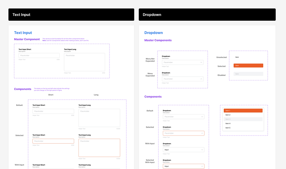
Creating a Design System – designing for consistency
The design system, was organised as Foundations and Components, in order of increasing complexity. Foundations informed the design of the Components, and ensured consistency throughout the design system.
01
Foundations
I started off with organising the System's Foundations, namely Typography, Colour and Spacing.
These different foundations were then added into a Figma Library, for easy access later on.

Typography
A basic set of Heading and Body typography styles was created with reference to Apple's Human Interface Guidelines (e.g. font size 11 being the smallest size for mobile UI). Notes were also included throughout the Figma file to ensure that other designers and developers on the team can easily access further details as needed.
Colour
A basic set of colours had already been selected before I joined the team, to include a few neutrals and an accent colour for important information. I expanded on the set of colours to include different shades of each hue, allowing a wide selection of colours while maintaining an overall coherence.
Spacing
This was also added based on a 4pt grid to ensure that the different screens would remain aligned and cohesive as the platform was developed.
02
Components
With the Foundations confirmed, I proceeded with making the various components. They were also created with reference to UI Libraries, like Material UI, Tailwind UI and Headless UI. This ensured that the components aligned with UI best practices and standards used on other platforms, creating familiar elements that would better guide users further down the road.


Design – refining screens for development
Before I joined the team, the other designers had already drafted a preliminary outline of the application to test with potential users. When I joined the team, the priority was to make and refine the screens to hand over to the front-end developers for production.
I was tasked with refining these preliminary ideas and preparing the files for our developers. Figma's Dev Mode was used for this, allowing us to include annotations for further clarification as well.

Pictured: screens compiled for developers, and annotations with details
The screens were organised according to their respective flows, with each separate screen showing the different possible interactions on the page, errors and other details.
Some screens were also labelled with annotations in Figma's Dev Mode, to ensure clarity on some interactions that are not immediately obvious.
